

Lean Joe Bean
Special thanks to my Creative Director on this project: Rhion Magee

Launching a new brand from scratch doesn’t mean it’s ingredients are new.
The challenge with branding a new weight-loss coffee product seems simple: make it stand out. However, when faced with a vast and visually loud health and fitness industry, an “in your face” approach doesn’t cut it.
Also, since coffee is already ingrained into people’s daily routines, we need them to replace their current coffee with ours. Yikes!
The first step is identifying the fonts, colors, and textures that emulate the current visual languages of coffee shops and athletic clubs. Our goal is to simplify our visual brand into an easily understood message:
Fit Coffee
This coffee slims you down and looks good, yes please!

Now, to best illustrate how the product would live in the world, we did two things:
Render our options as the final packaging
Speak with a unique color that challenges the norms
Here, we knew we had to bridge the gap between a logo for a brand no one had heard of before and a product people would choose over others.

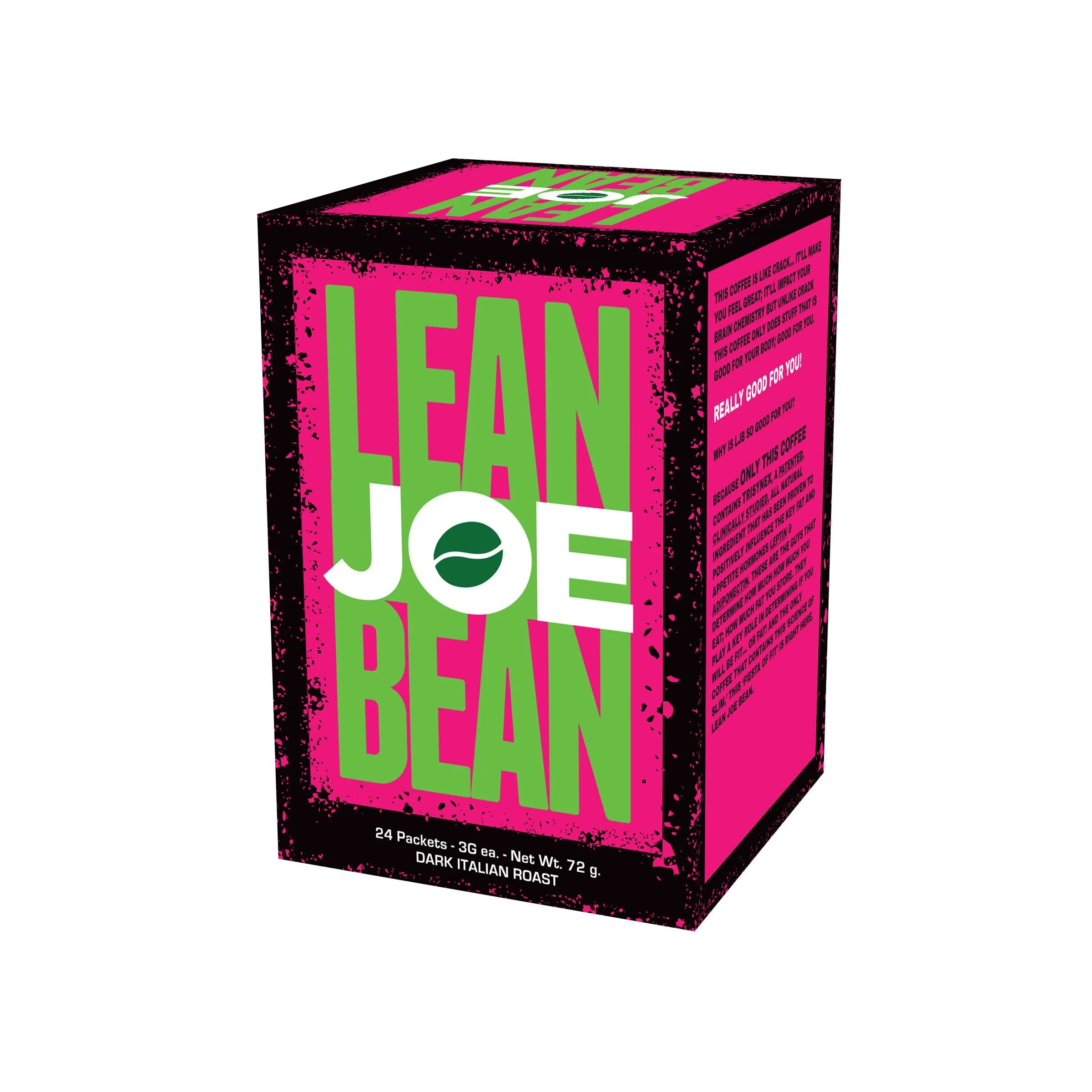


Luckily, the winning formula was a punch-out in light green to signify health, an earthy brown for coffee, and an electric magenta for that fat-loss jolt other brands lack.
I’m truly delighted the client chose this clean and original design that is a clear cut above.


